With the ReporteRs package we can automate our reports and save a lot of time and avoid errors that can occur by manual reporting. Of course there are other possibilities to create reports too, for example with knitr, but with ReporteRs we can create great PowerPoint or Word reports.
In this example I will use the data used by the Creating a complex chart in R.
> data
          Total Product A Product B Product C Product D Profit
New York    787       340       160       161       126  83000
Bangkok     751       356       206       127        62  62000
Paris       743       408       155        93        87  85000
El Paso     696       259       209       108       120  78000
Sidney      696       270       190       176        60  47000
Shanghai    654       238       198       141        77  41000
Auckland    643       191       168       148       136  39000
Beijing     630       235       117       160       118  76000
Houston     570       199       175        99        97  51000
Amsterdam   531       180        95       170        86  55000
Of course we can automate the data import and combine as well, but because of the many possibilities and different datasources this post is not about that.
To make a nice pptx from our data, first we need a template. In our case it is the Template.pptx.
> library(ReporteRs)
> report<-pptx(template="Template.pptx")
Next we format the title slide. With the addSlide command we define what kind of slide layout we use (here Title). The slide layouts have to be defined in the template pptx. We add a title, a subtitle and a date too.
> report <- addSlide(report, "Title")
> report<-addTitle(report, "Top Sales Offices")
> report<-addSubtitle(report, "Reporting example - RManic")
> report<-addDate(report)
The title slide:
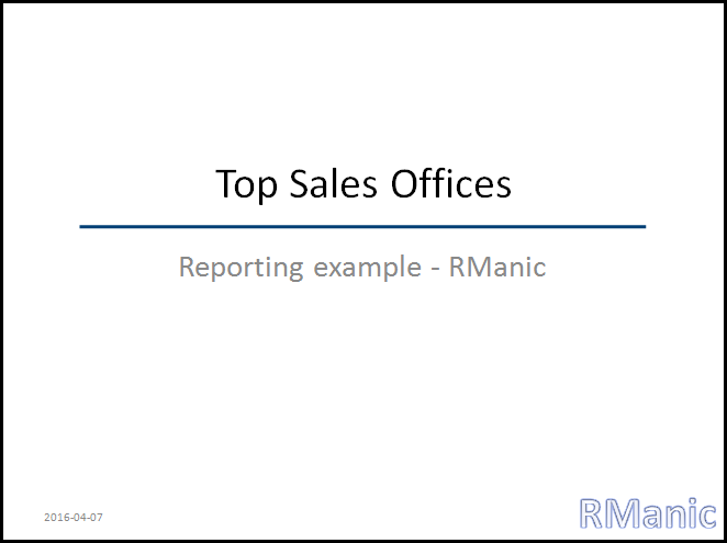
On the next slide we want to have some text too, we will use a Title and Content layout. Here will be shown the top 3 sales offices according to different criteria.
> report <- addSlide(report, "Title and Content" )
> report<-addTitle(report, "Top 3 Sales Offices according to")
Firtst we specify the rows. The current data about the offices will be automatically replaced. There will be 16 rows on this slide.
> par1<-pot("Profit:", textProperties(font.size = 15, font.weight="bold"))
> par2<-pot(paste(rownames(data[order(-data$Profit),])[1], ": ", data$"Profit"[order(-data$"Profit")][1], "$", collapse=""), textProperties( font.size = 12 ))
> par3<-pot(paste(rownames(data[order(-data$Profit),])[2], ": ", data$"Profit"[order(-data$"Profit")][2], "$", collapse=""), textProperties( font.size = 12 ))
> par4<-pot(paste(rownames(data[order(-data$Profit),])[3], ": ", data$"Profit"[order(-data$"Profit")][3], "$", collapse=""), textProperties( font.size = 12 ))
> par5<-pot("number of sales of product A", textProperties(font.size = 15, font.weight="bold"))
> par6<-pot(paste(rownames(data[order(-data$"Product A"),])[1], ": ", data$"Product A"[order(-data$"Product A")][1], collapse=""), textProperties( font.size = 12 ))
> par7<-pot(paste(rownames(data[order(-data$"Product A"),])[2], ": ", data$"Product A"[order(-data$"Product A")][2], collapse=""), textProperties( font.size = 12 ))
> par8<-pot(paste(rownames(data[order(-data$"Product A"),])[3], ": ", data$"Product A"[order(-data$"Product A")][3], collapse=""), textProperties( font.size = 12 ))
> par9<-pot("number of sales of product B", textProperties(font.size = 15, font.weight="bold"))
> par10<-pot(paste(rownames(data[order(-data$"Product B"),])[1], ": ", data$"Product B"[order(-data$"Product B")][1], collapse=""), textProperties( font.size = 12 ))
> par11<-pot(paste(rownames(data[order(-data$"Product B"),])[2], ": ", data$"Product B"[order(-data$"Product B")][2], collapse=""), textProperties( font.size = 12 ))
> par12<-pot(paste(rownames(data[order(-data$"Product B"),])[3], ": ", data$"Product B"[order(-data$"Product B")][3], collapse=""), textProperties( font.size = 12 ))
> par13<-pot("number of sales of product C", textProperties(font.size = 15, font.weight="bold"))
> par14<-pot(paste(rownames(data[order(-data$"Product C"),])[1], ": ", data$"Product C"[order(-data$"Product C")][1], collapse=""), textProperties( font.size = 12 ))
> par15<-pot(paste(rownames(data[order(-data$"Product C"),])[2], ": ", data$"Product C"[order(-data$"Product C")][2], collapse=""), textProperties( font.size = 12 ))
> par16<-pot(paste(rownames(data[order(-data$"Product C"),])[3], ": ", data$"Product C"[order(-data$"Product C")][3], collapse=""), textProperties( font.size = 12 ))
Then we define the paragraphs. There will be in ordered and unordered list in two levels. With append=TRUE the paragraphs will be appended.
> report<-addParagraph(report, set_of_paragraphs(par2, par3, par4), append=TRUE, par.properties=parProperties(list.style = 'unordered', text.align="left", padding.left=15, level=2))
> report<-addParagraph(report, par5, append=TRUE, par.properties=parProperties(list.style = 'ordered', text.align="left", padding.top=15, level=1))
> report<-addParagraph(report, set_of_paragraphs(par6, par7, par8), append=TRUE, par.properties=parProperties(list.style = 'unordered', text.align="left", padding.left=15, level=2))
> report<-addParagraph(report, par9, append=TRUE, par.properties=parProperties(list.style = 'ordered', text.align="left", padding.top=15, level=1))
> report<-addParagraph(report, set_of_paragraphs(par10, par11, par12), append=TRUE, par.properties=parProperties(list.style = 'unordered', text.align="left", padding.left=15, level=2))
> report<-addParagraph(report, par13, append=TRUE, par.properties=parProperties(list.style = 'ordered', text.align="left", padding.top=15, level=1))
> report<-addParagraph(report, set_of_paragraphs(par14, par15, par16), append=TRUE, par.properties=parProperties(list.style = 'unordered', text.align="left", padding.left=15, level=2))
The Title and Content Slide:
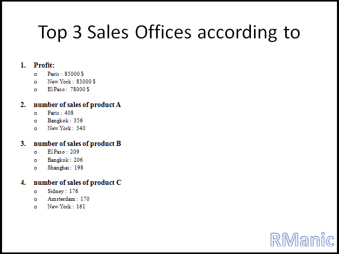
Finally we are creating a slide with a chart. We will use the chart from the Creating a complex chart in R post (some sizes eg. margin and font will be different).
> report <- addSlide( report, "Title and Content" )
> report<-addTitle(report, "Chart")


There are some variables we have to calculate and define first.
> data$CumProp<-cumsum(data$Total)/10000
> maxCumProp<-max(data$CumProp)
> data$CumProp<-data$CumProp*(max(data$Total)/max(data$CumProp))
>
> labels<-sapply(data[,2:5], function(x) paste(round(100*(x/data[,1]), 0), "%", sep=" ") )
> labelcoor<-cbind(data[,2]/2,
+                  data[,2]+data[,3]/2,
+                  data[,2]+data[,3]+data[,4]/2,
+                  data[,2]+data[,3]+data[,4]+data[,5]/2)
>
> legend<-c("Product A", "Product B", "Product C", "Product D")
>
> colors<-c("#CC941399", "#005A9452", "#C383ED99", "#00B8C199", "#FF000099")
The function of the chart:
> chart<-function()
+ {
+   par(xpd=TRUE, bg="transparent", mar=c(0,0.7,1,0.5))
+   layout(matrix(c(1,1,1,2,3,4,0,5,0,6,7,0), 4, 3, byrow = TRUE), width=c(1,3,2),
+          heights=c(0.6,2,0.7,0.8), respect = TRUE)
+   #1
+   plot.new()
+   title("Top 10 Sales Offices", line=-1, cex.main=3.5, font.main=2)
+   #2
+   plot.new()
+   text(0.6, 0.5, "Absolut Number of Sales", cex=2, srt = 90)
+   #3
+   chart<-barplot(t(as.matrix(data[,2:5])), axes=FALSE, border="transparent", mar=c(0,0,0,0),
+                  beside=FALSE, col=colors[1:4], axisnames=FALSE, space=0.3:0.3)
+   lines(chart, data$CumProp, lwd=1)
+   points(chart, data$CumProp, pch=16)
+   axis(4, at=seq(from=0, to=max(data[,1]), by=max(data[,1])/4),
+        lab=paste(round(100*seq(from=0, to=maxCumProp, by=maxCumProp/4),2), "%", sep=""),
+        las=2, cex.axis=1.5)
+   axis(2, at=seq(from=0, to=max(data[,1]), by=max(data[,1])/4),
+        lab=round(seq(from=0, to=max(data[,1]), by=max(data[,1])/4),0),
+        las=2, cex.axis=1.5)
+   text(chart+0.1, labelcoor, labels, cex=1.5)
+   text(c(0.7, chart[2:length(chart)]), data$Total+30, data$Total, cex=1.7)
+   #4
+   plot.new()
+   text(0.2, 0.5, "Cumulative Proportion of Sales", cex=2, srt = 270)
+   legend(0.35,0.8, legend, fill=colors[1:4], border="transparent", cex=2, bty="n")
+   #5
+   plot.new()
+   text(seq(from=0.02, to=0.98, by=0.93/9), t(rep(0.7, length(rownames(data)))), rownames(data), cex=1.5, srt = 30)
+   #6
+   plot.new()
+   text(x=0.4, y=0.55, "Profit (USD)", cex=2, srt=90)
+   #7
+   profit<-plot(data$Profit, type="b", axes=FALSE, col=colors[5], lwd=1, xlab="", ylab="")
+   text(seq(from=1.2, to=10.2, by=1), data$Profit+5000, data$Profit, cex=1.5)
+   axis(2, at=seq(from=35000, to=100000, by=100000/4),
+        lab=round(seq(from=35000, to=100000, by=100000/4),0),
+        las=2, cex.axis=1.5)
+ }
And we are adding the chart to the slide and save our report. The chart will be editable in the pptx. If we don’t want that, set editable=FALSE .
> report <- addPlot( report, function() chart(), width=9, height=5)
>
> writeDoc( report, "Rmanic.pptx" )
The last slide:

It is also possible to create a batch file from our script and schedule the report delivery and enjoy the results without any additional work.
